Tango Out
A simplified calling experience was only the beginning
A simplified calling experience was only the beginning
I led the UX strategy and visual design for Tango Out. A feature used by millions of people to make phone calls around the world on both Android and iOS. I simplified the calling experience by focusing on meaningful core interactions that create value. A clear and usable experience was the icing on the cake.
Tango Out needed to be accessible, yet unobtrusive. People endured too much friction trying to access a feature buried three UI layers deep. Tango Out needed to live along side the free calling features without overshadowing it.
Free Video & Voice Calls needed to live along side Tango Out Calls without causing confusion. People had a difficult time understanding the difference between the two types of calls. Both types of calling functionality needed to be equal, yet distinguishable.
Tango Out's true competitor wasn't other calling apps. It needed to be easier to use than the native dialing experience on both Android and iOS. We wanted to replace the habit of using the native dialing experience when you need to make a call.
At the relaunch, Tango Out will only be available to approximately 100 countries world-wide. We wanted to keep a close eye on usage to make sure costs were sustainable. Opening up more calling corridors depends on the usage patterns and sustainability.
The new Tango app would ship without the ability to view a list of your contacts. Although I didn’t agree with this decision, it was definitely a force baring down on the design. This situation may change depending on future iterations and feedback.
We needed a way to turn off the feature in case usage costs became too expensive. New calling corridors will roll out in a controlled pace to allow us to track usage and costs. This would allow us to build a sustainable product feature that didn’t break the bank.
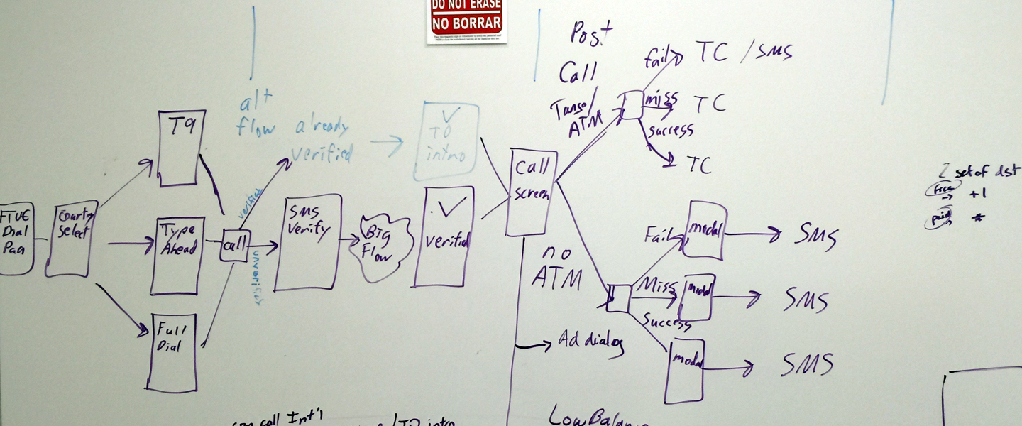
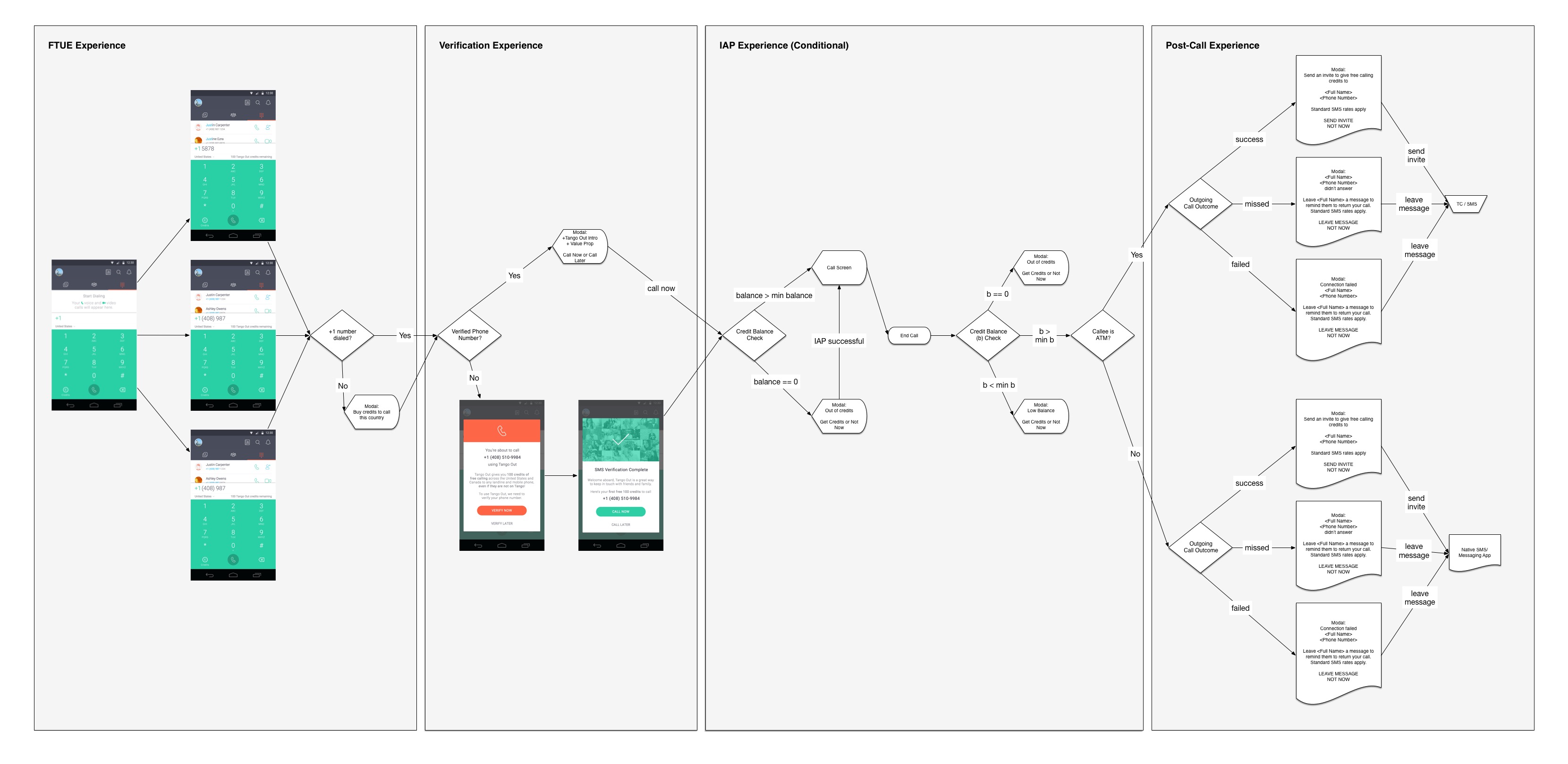
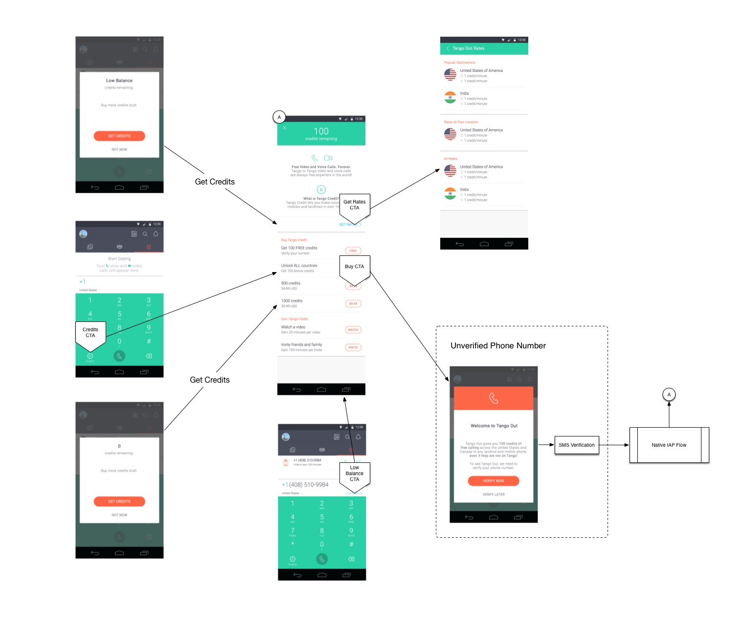
In order for a person to call a land line or mobile number, required us to verify their phone number via SMS. Going forward, we needed to avoid the unnecessary SMS Verification costs. We decided to only verify their number if they intended on using Tango Out.
We did just enough research to have a good understanding of habits and motivations. We synthesized learnings from recent user and market studies to drive our planning phase.
Below are the key insights that motivated the initial version of Tango Out's relaunch:
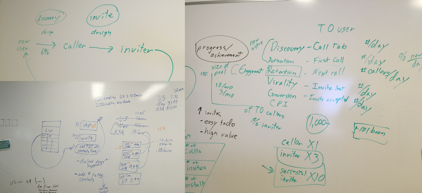
The majority of people on Tango seemed to have close-knit social circles. Both app usage and retention were stable once a person had at least six contacts in their social graph. We needed to find a way to help people get to that magic number.
We identified people who bought credits as Callers. Callers proved to have made repeat purchases. We also found out that they also had no intention of invite others to Tango to earn free credits.
It was always an assumption, but we thought people only cared about themselves. We were right. No matter how we wrote Invite-related copy, people only cared about what they would get in return. Understanding this behavior changed how we communicate with them.
Callers showed poor invite conversions because the timing was poor. We asked them to invite their contact even when the call failed. That's like asking someone to watch a movie you thought was terrible.
People had a difficult time understanding differences between Tango-to-Tango calls and Tango Out calls. Not only did they not know which calling feature they were using when trying to make a call. They also didn't know when to use either feature.
Many people showed concern about the costs of calling someone. Whether it was free video and voice calls or Tango Out. They ended up being fearful even when making free calls. This had to change.
I believe people want simple but useful default actions that yield value immediately. People want to be able to take action without needing to weight the effort required. They want simple tools that allow them to do a lot.
I believe people will make more phone calls when the effort required to take action is low. The dial pad should be within reach if they want to call someone who isn't on Tango already. Having the dial pad available, but not be obtrusive will play a key role with feature adoption.
I believe people generate a negative emotion when they either miss a phone call or fail to reach someone. Tango Out should help people to make a successful phone call after the first their failed attempt. Successful connections would lead to better conversions for inviting others.
I believe Callers who do not buy credits do not want to feel burdened by having to keep track of credits. As the old saying goes, "out of sight, out of mind." A person's Credit Balance is only important to them when they actually have a balance.
Listening to the people who would be using the product was key. I observed and listened to not only what people said, but what they actually did. This approach was essential to creating something people will actually use.
Design Principles help define and communicate key characteristics of an experience across an organization. They provide a basic foundation to gauge design decisions. Teams can move forward with design decisions with a deeper understanding of their reasoning.
A person should be able to initiate a call from any part of the app.
Task completion requires very little effort and guidance.
Prices and fees are to be shown clearly and honestly.
Communicate clearly and honestly.
Tango is known for a great call experience. Don’t disrupt the experience with fancy UI.
I provided design documentation for key experience flows. The documentation created consistent communication across teams. It also allowed for quicker discussions that generated value for all those involved.
I fell in love with the problem, not the ideas. I approached the problems with an objective lens to allow myself to find the best solution for the user. I validated iterations using interactive prototypes during usability studies to find the solutions.
I believe prototypes are essential for communicating a design's intent and then validating it. I used InVision to explore experience flows and Principle to understand motion and interactions.
Patterns allow for changes to happen independent of others. This kind of flexibility allows for UI components that have focus and simplicity. The arrangement of patterns create the end-product.
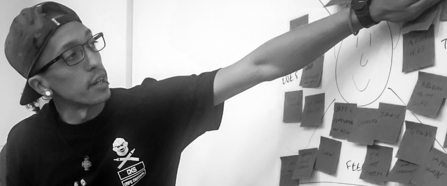
We brought in real Tango users for observation using early builds on Android. We had presented them with simple tasks related to the Tango Out calling feature.
The results were enlightening and humbling at the same time:
We assumed that explaining Tango Out would make the feature more clear. Explaining what Tango Out was lead to more confusion in the end. I decided to rely on the affordance of a feature to reveal its intent.
As we observed the participants in the test groups, we concluded that there were two types of people. The first type, were people who were familiar with similar product offerings already. The second type, were people who understood the product offering but shown no interest in it.
People's behaviors were evident. We needed to decide how important it was that we create focus on Tango Out. These findings led to discussions to prioritize Tango Out against the free calling features.
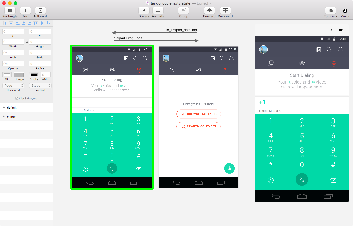
At the beginning, we had the assumption that having the dial pad open from the start would be clear. I decided to keep the dial pad hidden until the user showed clear intent of wanting to dial. Tapping on the FAB revealed the dial pad distinguishing free calls and Tango Out.
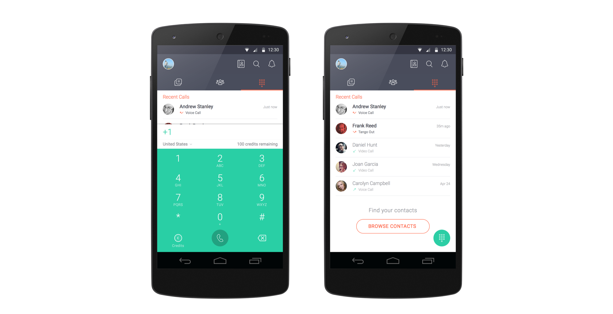
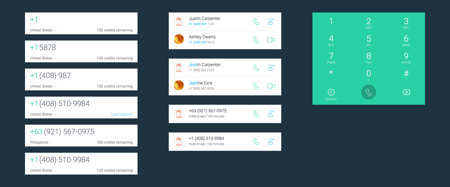
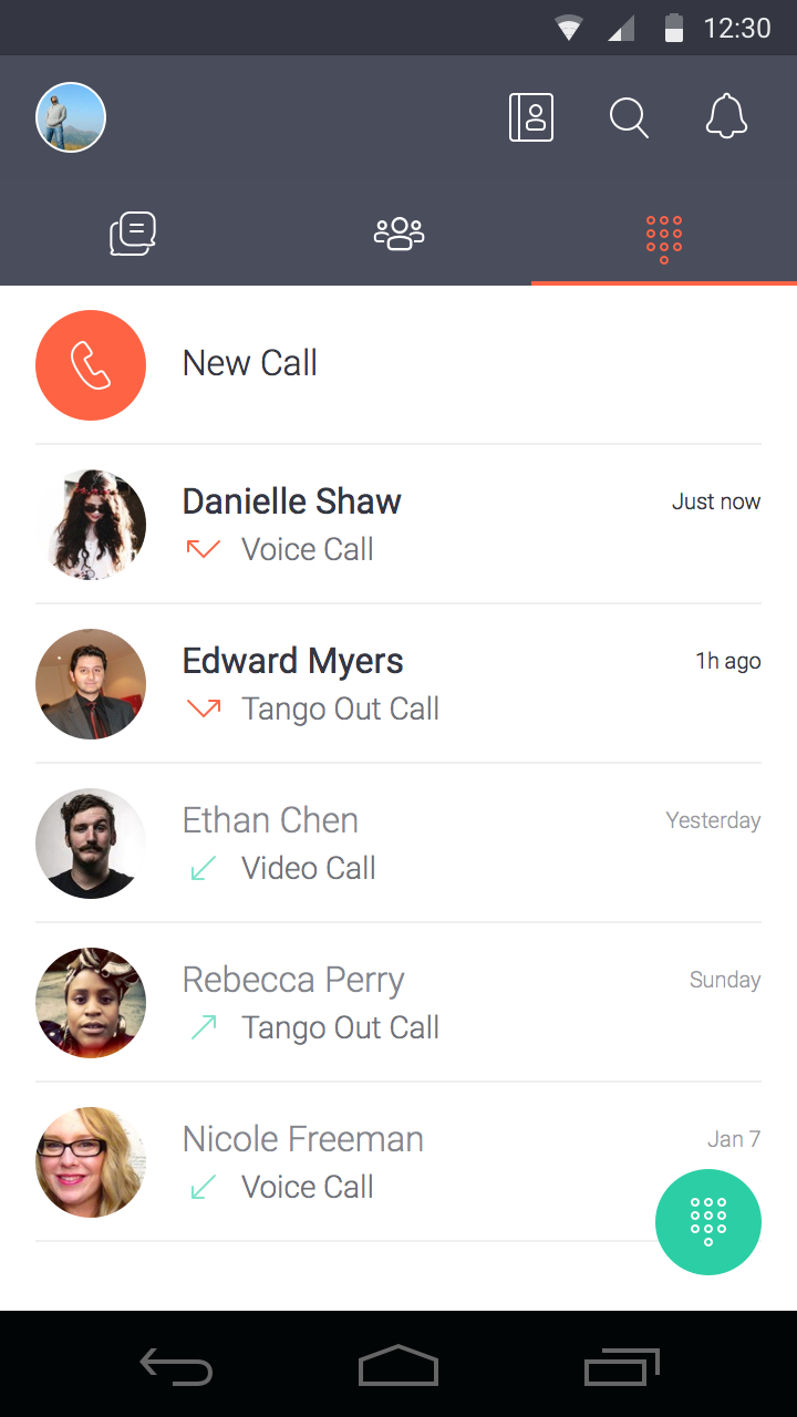
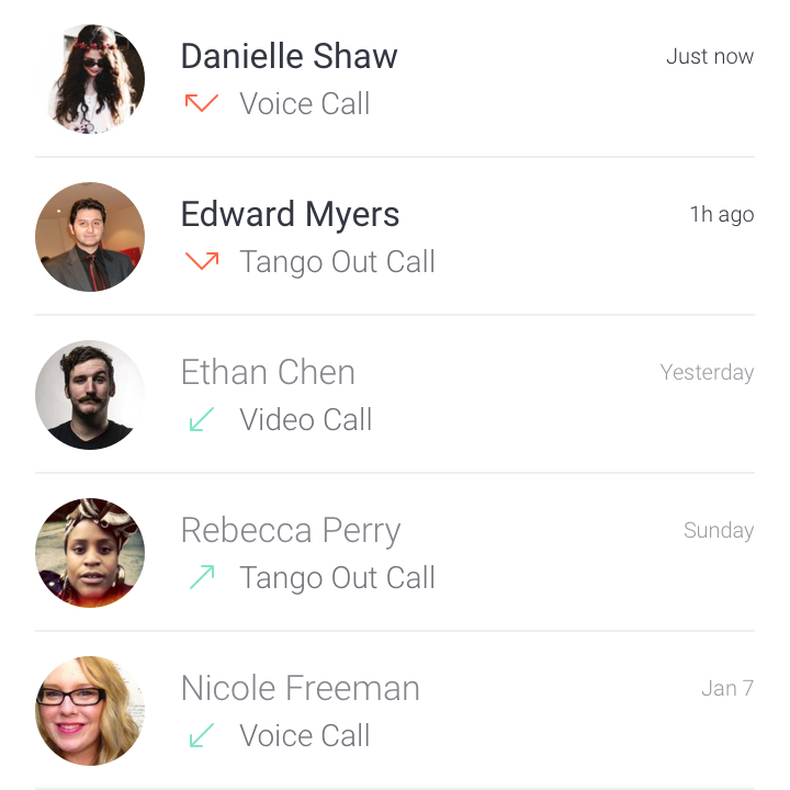
When the dial pad isn't open, the focus is on the Call Log. The call log lists every call made, received, or missed. Highlighted entries act as subtle nudges to take care of missed calls.
When it comes to being helpful, timing and context is essential. No one likes interruptions when the timing or context is out of place. We wanted to be helpful when you need it, but not overbearing when you don't.
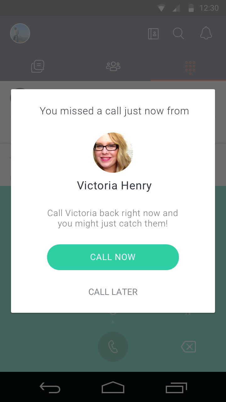
A quick call back option presents itself if you check your phone within minutes of missing a phone call. This experience enhances ability at the right time within the right context. We'll help you make a successful connection with best effort possible.
We all catch ourselves spinning wheels parsing timestamps at times. Sometimes its quick, and at other times it feels like a lot of cognitive load. We decided to provide contextual timestamps in buckets of time we all ready sort by.
"Just now" timestamps gave people the feeling of being able to return the missed call and having a chance having a successful phone call.
Using the call log defaults to using the last call method used during the last call. The caller no longer has to worry about which calling method to use. The user is presented with call options in the situation where a contact qualifies for various call methods or numbers.
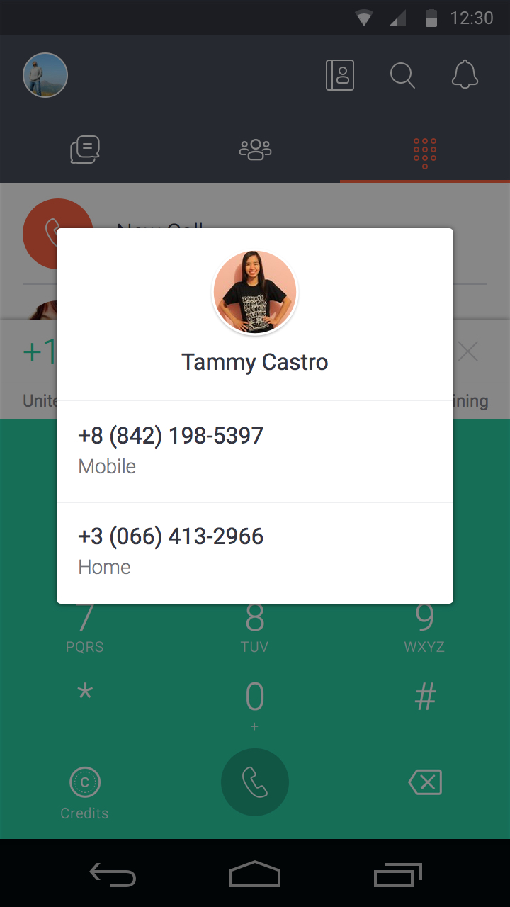
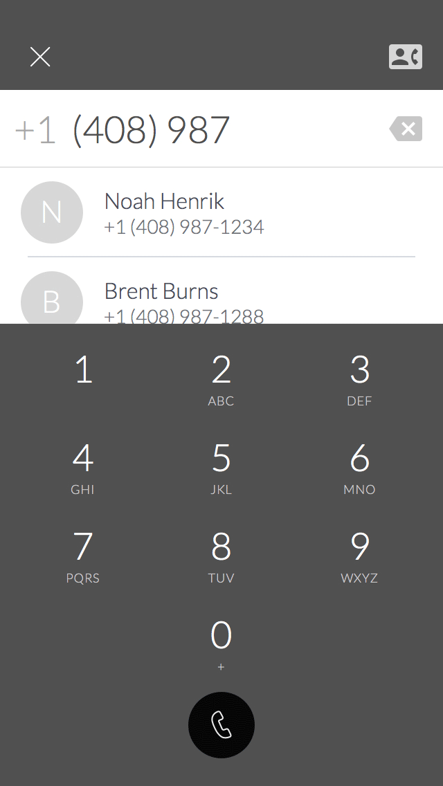
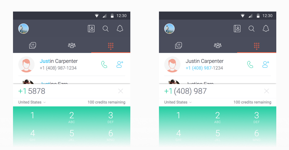
We gave the user multiple ways of find who they wanted to call. Android's T9 search capability was a common behavior pattern among our Android users. Match-based search was provided for both iOS and Android users.
Asking the user to do something for you is much easier when you leave them with a good experience. The lasting impression of quality and accomplishment leads for sharing without much effort. Successful calls led to more invites sent and conversions.
The real experience that people attach value to was the actual call itself. The responsibility of the dialing experience is to set the perceived speed of making a phone call. This accounted for half of the entire calling experience from end to end.