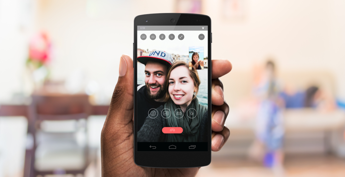
Tango Video Calling
A new take on a familiar video calling experience
A new take on a familiar video calling experience
I led the UX strategy and visual design for Tango Video Calling. A feature used by millions of people to make phone calls around the world on both Android and iOS. I simplified the calling experience by focusing on meaningful core interactions that create value. A familiar experience for the user was the icing on the cake.
Through research and insights, we know engagement in video calls lead to higher retention. It's now time that we attempt to create a better experience for video calling. We needed a way to promote in-call games and other experiences shared between the caller and callee.
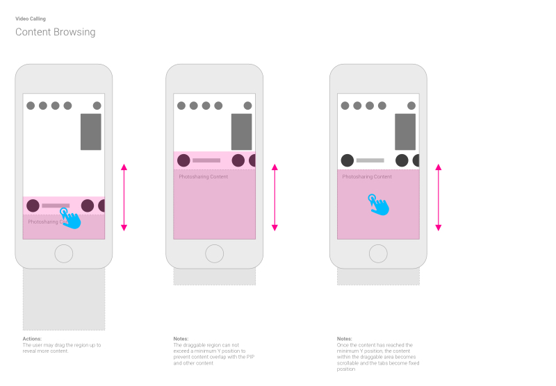
Promote engagement through subtlety. We needed to create an experience where the user would be free to discover content. We also needed a way to be able to add and remove content.
With many plans for more content in the future, I needed to devise a solution for navigating. We also needed to use familiar interaction models while still making best use of the medium. It was also important to make the interactions delightful through direct manipulation.

With a short timeline, the only way to validate ideas was through experimentation. The only way to accommodate experimentation in this context was to allow for flexibility. UI elements and components could come and go depending on their level of engagement.
We had a rather short runway for a project timeline. We wanted to release the first portion of the redesign in Q1 of 2016. This of course meant moving forward with insights, data, and subject matter interviews.

I needed to find out all that I could in the shortest amount of time. I conducted several Subject Matter Interviews with leadership and the User Research team. This approach allowed me to move forward with ideation and prototyping.
We decided not to introduce new experiences to keep the learning curve shallow. We decided to adapt Tango's Chat Drawer experience to fit the new context of video calling. We believed this would allow the user to enter the new experience without the feeling lost.
Like city planning and development, designing for expansion requires systematic planning for the future. I relied on using focused patterns that have no dependency on one another. This approach allowed the flexibility needed to design for today's context, and tomorrow's challenges.
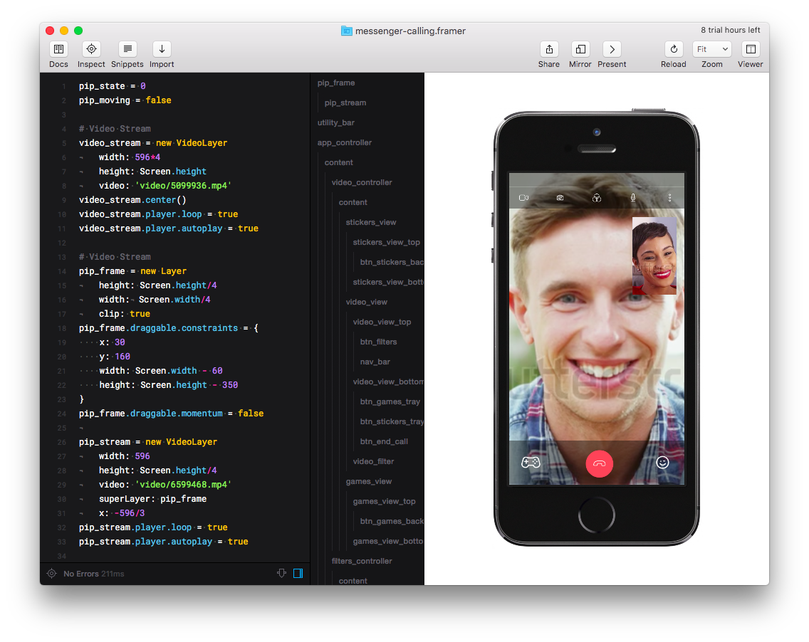
I prototyped core interactions in Framer.js and Principle for Mac. This allowed me to validate ideas and discover experience gaps. Generating dialogue and feedback from across the organization was key to hitting the mark.
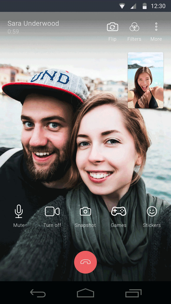
The user is on a video call. Don’t take away from the experience.
Anticipate the user’s intentions. Intelligently design to support them through their experience.
The best experience will evoke emotion and build rapport. Support the experience through function and emotion.
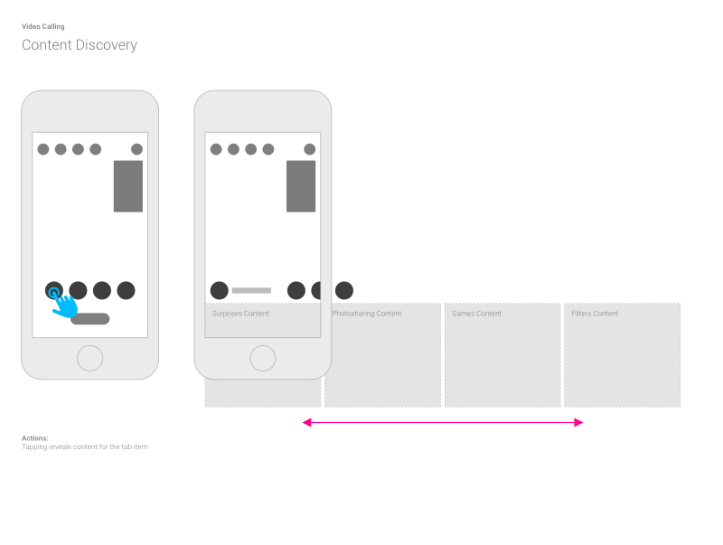
Using a carousel for browsing and navigating content allowed us to avoid dead ends. The user could navigate through an endless cycle of content and not worry about getting lost.
The content area does not obstruct the entire view of the video call. This acts as a constant reminder for the user that they are still on a video call. It allowed the user to see the applied effects as they played with controls and content.
The new interface allows for the use of gestures to manipulate and navigate content. However, not all affordances are lost. Users can still tap on content and navigation to reveal content.

Resisting the urge to shove all the ideas into one prototype was key. It allowed me to validate ideas fast without running into many obstacles. I conveyed short and simple ideas through a handful of prototypes to reduce complexity.
I switched between using Framer.js and Principle. I used Framer.js to do a lot of heavy lifting to mimic complex features in my prototypes. I leaned on Principle to convey ideas on simple interactions. Choosing the right tool for the job allows me to move forward with high velocity.