Recurly app
A tactical redesign of mission critical software
A tactical redesign of mission critical software
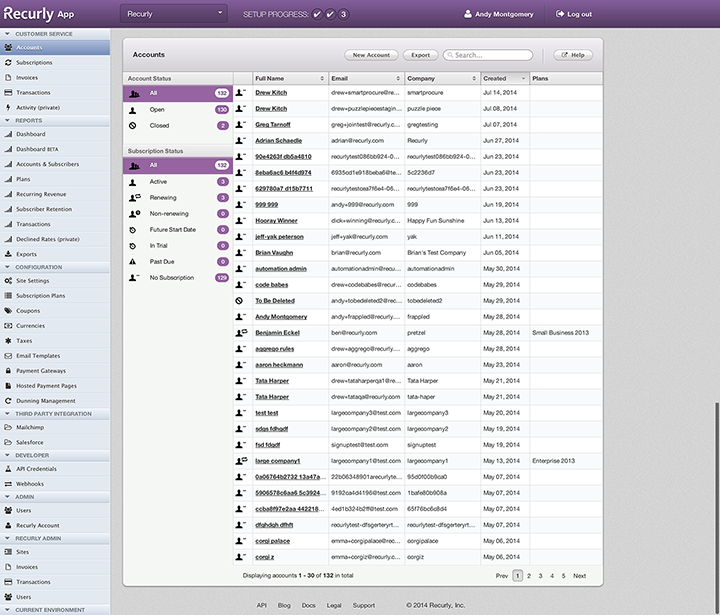
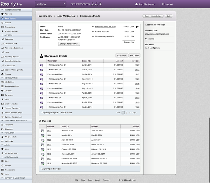
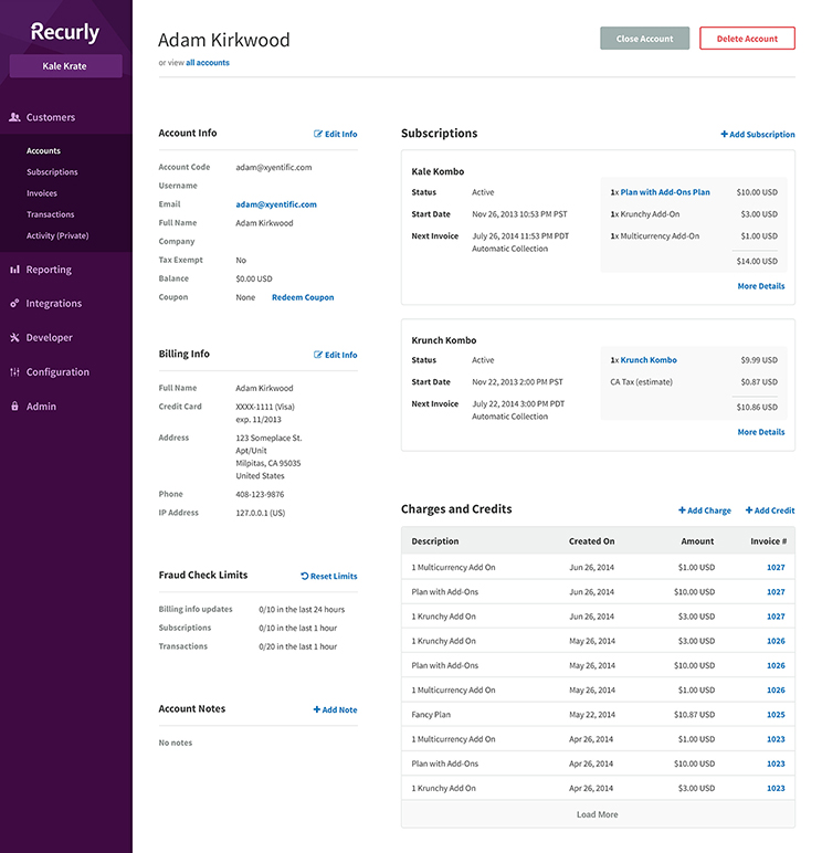
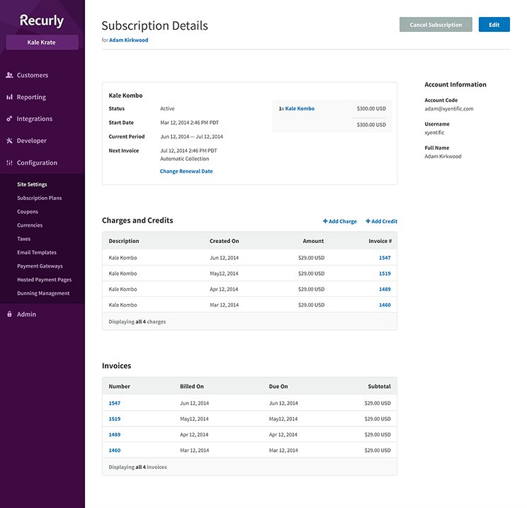
Recurly app, a robust recurring billing solution, felt dated at the aesthetic level. Myself and 3 other designers decided to create a new visual foundation to build upon. I worked on design visuals down to the nitty gritty details of implementation. I focused on identifying and establishing design patterns. Coordinating across teams to ensure consistency between design and implemented UI.
The old Recurly app looked dated and felt static. We wanted to improve on the experience by evoking a more modern feel. Doing so meant thinking beyond where we were and to look forward where we wanted to be.
Find experiences a long the way that we can improve on without much effort. Just like every engineering team, design teams also incur design debt. This was our chance to reduce our debt and finally scratch that itch.
Recurly app had a few eye sores where inconsistency in visual elements and design patterns. We needed to identify and tackle those inconsitencies with new established patterns. Creating consistency within the app will also help lessen the learning curve for new users.
First rule of a redesign: Do no harm. This is especially try true when you're redesigning mission critical software. We decided to move mountains with a spoon, one scoop at a time.

The client-side team decided to leverage Angular.js and React.js. This created excitement within the company, but raised questions for the design team. We knew we'd have to learn some of the technical constraints for us to work through.
The new app would be API-driven, taking advantage of Angular.js' abilities. This meant understand what is feasible and what was a stretch goal. We would need to design for the future, then scale it back to make it work now. What API endpoints weren't available would need to be built.

Good design isn't obtrusive. This is where we needed to take extra caution in our redesign efforts. The redesign shouldn't interrupt workflows that are critical to our amazing clients.
Accomplishing this redesign wasn't going to be easy. We designed across and worked with the Core and Platform teams to make sure we're hitting the mark. We needed to identify opportunities at the client-side down to the platform layer.
Identify and isolate UI elements to adopt as design patterns. Establishing design patterns was going to be a key tactic for future iterations. This meant that we'd be able to iterate on individual patterns without affecting others.
Quick iterations and immediate validations were going to play a huge role. We decided to design in the open with a handful of clients to gather feedback and insights along the way. The dialogue between the design team and our users proved to be a huge wealth of insights that guided us.

We established a pattern library for both Photoshop and Sketch. I worked with the client-side teams in implementing patterns into Angular components.

Rallying support and excitement is much easier when you can show results. Once we had an internal beta of our new client-side interface, the momentum began to build. We knew this was just the beginning of changes to come.

Identifying and establishing patterns is critical in creating consistency across teams. Design patterns allowed us to iterate on ideas, experience flows, and visuals with velocity. Focused and isolated changes were essential in tactical design iterations.
I was still ramping up on Angular.js at the time. However, I saw great value in understanding the fundamental concepts of such frameworks. Knowing the constraints of each will allow for proper innovation in future challenges.